简单介绍
G6是由蚂蚁金服体验技术部开发的图可视化引擎,提供了一系列设计优雅、便于使用的图可视化解决方案,便于开发者搭建图可视化、图分析、图编辑应用。
相关链接
核心概念
G6中的核心概念如下方的思维导图展示:
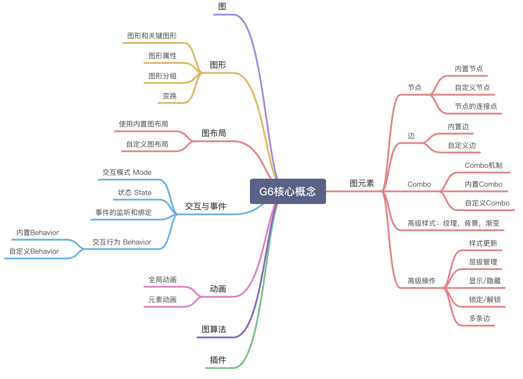
本文作为入门教程,主要介绍一些G6中常用的概念知识:
- 图
- 图元素
- 节点
- 边
- 交互与事件
- 动画
- 插件
使用入门
第一个G6应用
<!DOCTYPE html>
<html lang="en">

<head>
  <meta charset="UTF-8" />
  <title>Tutorial Demo</title>
</head>

<body>
  <!-- 图的画布容器 -->
  <div id="graph"></div>
  <!-- 引入 G6 -->
  <script src="https://cdn.bootcdn.net/ajax/libs/antv-g6/4.8.22/g6.min.js"></script>
  <script>
    // 定义数据源
    const data = {
      // 点集
      nodes: [{
          id: 'node1',
          x: 100,
          y: 200,
        },
        {
          id: 'node2',
          x: 300,
          y: 200,
        },
      ],
      // 边集
      edges: [
        // 表示一条从 node1 节点连接到 node2 节点的边
        {
          source: 'node1',
          target: 'node2',
        },
      ],
    };
    // 创建 G6 图实例
    const graph = new G6.Graph({
      container: 'graph', // 指定图画布的容器 id,与第 11 行的容器对应
      // 画布宽高
      width: 800,
      height: 500,
    });
    // 读取数据
    graph.data(data);
    // 渲染图
    graph.render();
  </script>
</body>

</html>Graph 图
主体(objects)与关系(relationships)的组成。它甚至不局限于视觉,主体与关系的数据也可以称为图。
在 G6 中,Graph 对象是图的载体,它包含了图上的所有元素(节点、边等),同时挂载了图的相关操作(如交互监听、元素操作、渲染等)。
Graph 对象的生命周期为:初始化 —> 加载数据 —> 渲染 —> 更新 —> 销毁。
<div id="graph"></div>

<script>
const graph = new G6.Graph({
  container: 'graph',
  width: 800,
  height: 500,
});
</script>Node 节点
节点是关系图上常用的展示元素之一。
内置节点
G6 的内置节点包括 circle,rect,ellipse,diamond,triangle,star,image,modelRect,donut(v4.2.5 起支持)。
展示内置的默认节点及其样式,为每个节点设置唯一的id,并使用x,y设置节点位置,type指定节点类型,使用label展示默认的显示文本:
const data = {
  nodes: [
    {
      id: "node_circle",
      x: 100,
      y: 100,
      type: "circle",
      label: "circle"
    },
    {
      id: "node_rect",
      x: 200,
      y: 100,
      type: "rect",
      label: "rect"
    },
    {
      id: "node-ellipse",
      x: 330,
      y: 100,
      type: "ellipse",
      label: "ellipse"
    },
    {
      id: "node-diamond",
      x: 460,
      y: 100,
      type: "diamond",
      label: "diamond"
    },
    {
      id: "node-triangle",
      x: 560,
      y: 100,
      //size: 80,
      type: "triangle",
      label: "triangle"
    },
    {
      id: "node-star",
      x: 660,
      y: 100,
      //size: [60, 30],
      type: "star",
      label: "star"
    },
    {
      id: "node-image",
      x: 760,
      y: 100,
      size: 50,
      type: "image",
      img:
        "https://gw.alipayobjects.com/zos/rmsportal/XuVpGqBFxXplzvLjJBZB.svg",
      label: "image"
    },
    {
      id: "node-modelRect",
      x: 900,
      y: 100,
      type: "modelRect",
      label: "modelRect"
    },
    {
      id: "node-donut",
      x: 1030,
      y: 100,
      type: "donut", // 节点类型
      donutAttrs: {
        // 甜甜圈字段,每个字段必须为 [key: string]: number
        prop1: 10,
        prop2: 20,
        prop3: 25,
        prop5: 10,
        prop6: 20
      },
      label: 'donut'
    }
  ]
};
const graph = new G6.Graph({
  container: "graph",
  width: 1500,
  height: 300
});
graph.data(data);
graph.render();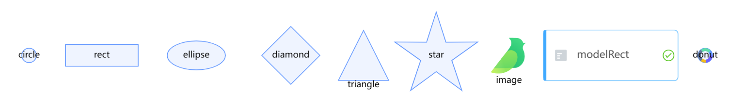
自定义节点
当内置节点无法满足实际业务需求时,可以通过G6.registerNode将自己编写的节点注册到G6中使用,registerNode总共需要三个参数:节点名称、节点配置定义、被继承节点类型。
如下是注册一个自定义的节点card-node的示例,该自定义节点继承自single-node(节点的基类),通过重写drawShape方法绘制节点。
drawShape方法共有两个参数,cfg和group,其中cfg是节点的配置对象,group是节点的图形容器。
const ICON_MAP = {
  a: "https://gw.alipayobjects.com/mdn/rms_8fd2eb/afts/img/A*0HC-SawWYUoAAAAAAAAAAABkARQnAQ",
  b: "https://gw.alipayobjects.com/mdn/rms_8fd2eb/afts/img/A*sxK0RJ1UhNkAAAAAAAAAAABkARQnAQ"
};

G6.registerNode(
  "card-node",
  {
    drawShape: function drawShape(cfg, group) {
      const color = cfg.error ? "#F4664A" : "#30BF78";
      const shape = group.addShape("rect", {
        attrs: {
          x: 0,
          y: 0,
          width: 200,
          height: 60,
          stroke: color,
          radius: 2
        },
        name: "main-box",
        draggable: true
      });

      group.addShape("rect", {
        attrs: {
          x: 0,
          y: 0,
          width: 200,
          height: 20,
          fill: color,
          radius: [2, 2, 0, 0]
        },
        name: "title-box",
        draggable: true
      });

      // left icon
      group.addShape("image", {
        attrs: {
          x: 4,
          y: 2,
          height: 16,
          width: 16,
          cursor: "pointer",
          img: ICON_MAP[cfg.nodeType || "app"]
        },
        name: "node-icon"
      });

      // title text
      group.addShape("text", {
        attrs: {
          textBaseline: "top",
          y: 2,
          x: 24,
          lineHeight: 20,
          text: cfg.title,
          fill: "#fff"
        },
        name: "title"
      });

      if (cfg.nodeLevel > 0) {
        group.addShape("marker", {
          attrs: {
            x: 184,
            y: 30,
            r: 6,
            cursor: "pointer",
            symbol: cfg.collapse ? G6.Marker.expand : G6.Marker.collapse,
            stroke: "#666",
            lineWidth: 1
          },
          name: "collapse-icon"
        });
      }

      // The content list
      cfg.panels.forEach((item, index) => {
        // name text
        group.addShape("text", {
          attrs: {
            textBaseline: "top",
            y: 25,
            x: 24 + index * 60,
            lineHeight: 20,
            text: item.title,
            fill: "rgba(0,0,0, 0.4)"
          },
          name: `index-title-${index}`
        });

        // value text
        group.addShape("text", {
          attrs: {
            textBaseline: "top",
            y: 42,
            x: 24 + index * 60,
            lineHeight: 20,
            text: item.value,
            fill: "#595959"
          },
          name: `index-value-${index}`
        });
      });
      return shape;
    }
  },
  "single-node"
);

const graph = new G6.Graph({
  container: "graph",
  width: 1000,
  height: 300,
  defaultNode: {
    type: "card-node"
  }
});

const data = {
  nodes: [
    {
      title: "node1",
      error: true,
      nodeType: "a",
      id: "node1",
      nodeLevel: 2,
      panels: [
        { title: "成功率", value: "11%" },
        { title: "耗时", value: "111" },
        { title: "错误数", value: "111" }
      ],
      x: 100,
      y: 10
    },
    {
      title: "node2",
      error: false,
      nodeType: "b",
      id: "node2",
      nodeLevel: 0,
      panels: [
        { title: "成功率", value: "11%" },
        { title: "耗时", value: "111" },
        { title: "错误数", value: "111" }
      ],
      x: 100,
      y: 110
    },
    {
      title: "node3",
      error: false,
      nodeType: "a",
      id: "node3",
      nodeLevel: 3,
      panels: [
        { title: "成功率", value: "11%" },
        { title: "耗时", value: "111" },
        { title: "错误数", value: "111" }
      ],
      collapse: true,
      x: 100,
      y: 210
    }
  ]
};

graph.data(data);
graph.render();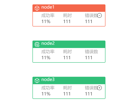
Edge 边
内置边
G6 提供了 9 种内置边:
line:直线,不支持控制点;
polyline:折线,支持多个控制点;
arc:圆弧线;
quadratic:二阶贝塞尔曲线;
cubic:三阶贝塞尔曲线;
cubic-vertical:垂直方向的三阶贝塞尔曲线,不考虑用户从外部传入的控制点;
cubic-horizontal:水平方向的三阶贝塞尔曲线,不考虑用户从外部传入的控制点;
loop:自环。
控制点:边的拐点
下面的代码展示了如何节点之间如何利用边相连,以展示节点之间的关系:
const data = {
  nodes: [
    { id: '1', x: 50, y: 50, size: 20 },
    { id: '2', x: 150, y: 50, size: 20 },
    { id: '3', x: 200, y: 50, size: 20 },
    { id: '4', x: 300, y: 130, size: 20 },
    { id: '5', x: 350, y: 50, size: 20 },
    { id: '6', x: 450, y: 50, size: 20 },
    { id: '7', x: 500, y: 50, size: 20 },
    { id: '8', x: 600, y: 50, size: 20 },
    { id: '9', x: 650, y: 50, size: 20 },
    { id: '10', x: 750, y: 50, size: 20 },
    { id: '11', x: 800, y: 50, size: 20 },
    { id: '12', x: 900, y: 150, size: 20 },
    { id: '13', x: 950, y: 50, size: 20 },
    { id: '14', x: 1050, y: 150, size: 20 },
    { id: '15', x: 1100, y: 50, size: 20 },
  ],
  edges: [
    { source: '1', target: '2', type: 'line', label: 'line' },
    { source: '3', target: '4', type: 'polyline', label: 'polyline' },
    { source: '5', target: '6', type: 'arc', label: 'arc' },
    { source: '7', target: '8', type: 'quadratic', label: 'quadratic' },
    { source: '9', target: '10', type: 'cubic', label: 'cubic' },
    { source: '11', target: '12', type: 'cubic-vertical', label: 'cubic-vertical' },
    { source: '13', target: '14', type: 'cubic-horizontal', label: 'cubic-horizontal' },
    { source: '15', target: '15', type: 'loop', label: 'loop' },
  ],
};

const graph = new G6.Graph({
  container: 'graph',
  width: 1500,
  height: 300,
  linkCenter: true, // 使边连入节点的中心
});
graph.data(data);
graph.render();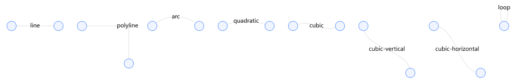
自定义边
在实际开发中,比较少需要直接开发一个新类型的边,更多的是基于现有边的扩展。
在如下的代码中,注册了一个名为circle-running的自定义边,通过重写afterDraw方法拓展了贝塞尔曲线内置边的样式,为其添加了动画,表明节点方向:
G6.registerEdge(
  'circle-running',
  {
    afterDraw(cfg, group) {
      // get the first shape in the group, it is the edge's path here=
      const shape = group.get('children')[0];
      // the start position of the edge's path
      const startPoint = shape.getPoint(0);

      // add red circle shape
      const circle = group.addShape('circle', {
        attrs: {
          x: startPoint.x,
          y: startPoint.y,
          fill: '#1890ff',
          r: 3,
        },
        // must be assigned in G6 3.3 and later versions. it can be any string you want, but should be unique in a custom item type
        name: 'circle-shape',
      });

      // animation for the red circle
      circle.animate(
        (ratio) => {
          // the operations in each frame. Ratio ranges from 0 to 1 indicating the prograss of the animation. Returns the modified configurations
          // get the position on the edge according to the ratio
          const tmpPoint = shape.getPoint(ratio);
          // returns the modified configurations here, x and y here
          return {
            x: tmpPoint.x,
            y: tmpPoint.y,
          };
        },
        {
          repeat: true, // Whether executes the animation repeatly
          duration: 3000, // the duration for executing once
        },
      );
    },
  },
  'cubic', // extend the built-in edge 'cubic'
);

const data = {
  nodes: [
    {
      id: 'node1',
      x: 100,
      y: 100,
      label: 'Node 1',
      labelCfg: {
        position: 'top',
      },
    },
    {
      id: 'node2',
      x: 300,
      y: 200,
      color: '#40a9ff',
      label: 'Node 2',
      labelCfg: {
        position: 'left',
        offset: 10,
      },
    },
  ],
  edges: [
    {
      source: 'node1',
      target: 'node2',
    },
  ],
};

const graph = new G6.Graph({
  container: 'graph',
  width: 1500,
  height: 300,
  defaultEdge: {
    type: 'circle-running',
    style: {
      lineWidth: 2,
      stroke: '#bae7ff',
    },
  },
});
graph.data(data);
graph.render();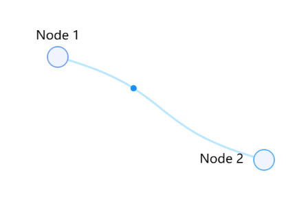
交互与事件
内置交互
G6主要考虑图可视化、图编辑、图分析三个主要场景的交互行为,内置了一些通用的交互事件。
以下列举一些常用的内置交互:
- drag-canvas:拖拽画布
- zoom-canvas:缩放画布
- drag-node:拖拽节点
- click-select:单击选中/取消选中节点
- brush-select:框选节点
- create-edge:创建边
const data = {
  nodes: [
    {
      id: "node1",
      x: 100,
      y: 100
    },
    {
      id: "node2",
      x: 300,
      y: 100
    }
  ],
  edges: [
    {
      source: "node1",
      target: "node2"
    }
  ]
};
const graph = new G6.Graph({
  container: "graph",
  width: 800,
  height: 500,
  modes: {
    default: [
      'drag-canvas',
      'zoom-canvas',
      'drag-node',
      'click-select',
      'create-edge',
      // 'brush-select'
    ]
  },
  defaultEdge: {
    type: 'quadratic',
    style: {
      stroke: '#F6BD16',
      lineWidth: 2,
    },
  },
  linkCenter: true
});
graph.data(data);
graph.render();

// 用于处理连线重叠
graph.on('aftercreateedge', (e) => {
  const edges = graph.save().edges;
  G6.Util.processParallelEdges(edges);
  graph.getEdges().forEach((edge, i) => {
    graph.updateItem(edge, {
      curveOffset: edges[i].curveOffset,
      curvePosition: edges[i].curvePosition,
    });
  });
});自定义交互
由于场景不一样,业务不一样,同样的目的需要的交互都不一样,因此内置的交互并不能覆盖所有的需求。
以添加节点为例,自定义一个点击画布,在点击位置添加节点的交互:
G6.registerBehavior("click-add-node", {
  getEvents() {
    return {
      "canvas:click": "onClick"
    };
  },
  onClick(ev) {
    const id = `${new Date().valueOf()}`;
    this.graph.addItem("node", {
      x: ev.canvasX,
      y: ev.canvasY,
      id: id
    });
  }
});监听和绑定事件
全局事件
只要在画布上范围内发生均会被触发,如 mousedown,mouseup,click,mouseenter,mouseleave 等。
获取点击对象的类型:
graph.on('click', (ev) => {
  const shape = ev.target;
  const item = ev.item;
  if (item) {
    const type = item.getType();
  }
});
Canvas事件
只在 canvas 空白处被触发,如 canvas:mousedown,canvas:click 等,以canvas:eventName 为事件名称。
graph.on('canvas:click', (ev) => {
  const shape = ev.target;
  const item = ev.item;
  if (item) {
    const type = item.getType();
  }
});
节点/边上的事件
例如 node:mousedown,edge:click, combo:click 等,以 type:eventName 为事件名称。
graph.on('node:click', (ev) => {
  const node = ev.item; // 被点击的节点元素
  const shape = ev.target; // 被点击的图形,可根据该信息作出不同响应,以达到局部响应效果
  // ... do sth
});

graph.on('edge:click', (ev) => {
  const edge = ev.item; // 被点击的边元素
  const shape = ev.target; // 被点击的图形,可根据该信息作出不同响应,以达到局部响应效果
  // ... do sth
});
时机事件
时机事件指渲染、视口变换、元素增删改、数据变换等时机发生的事件。
例如,在图渲染完成后的处理事件:
graph.on('afterrender', (ev) => {
  // ... do sth
});
自定义事件
可在任意位置通过graph.emit触发自定义事件,并通过graph.on进行监听
graph.on('some-custom-event-name', (ev) => {
  // ... do sth
});
graph.emit('some-custom-event-name', {
  // some params
})Mode 交互模式
用户在交互一张图时,可能由于意图不同而存在不同的交互模式,例如编辑和查看模式的切换;也会因为存在冲突的交互而感到困惑,例如页面滚动和缩放画布、拖拽画布和框选、点击创建边和节点选中。
重新回顾交互式示例 – 内置交互。
为了解决上述问题,G6 提供了交互模式 Mode,它是图上交互行为的管理机制。一个图上可以有存在多种交互模式,每个交互模式包含多种交互行为。
以图编辑和查看模式的切换为例,为图设置查看和编辑两种交互模式,默认为查看交互,并可以在两种交互模式间切换:
const data = {
  nodes: [
    {
      id: "node1",
      x: 100,
      y: 100
    },
    {
      id: "node2",
      x: 300,
      y: 100
    }
  ],
  // 边集
  edges: [
    {
      source: "node1",
      target: "node2"
    }
  ]
};

const graph = new G6.Graph({
  container: "graph",
  width: 800,
  height: 500,
  modes: {
    default: ["drag-canvas", "zoom-canvas"],
    edit: ["drag-canvas", "zoom-canvas", "drag-node", "create-edge"]
  },
  defaultEdge: {
    type: "quadratic",
    style: {
      stroke: "#F6BD16",
      lineWidth: 2
    }
  },
  linkCenter: true
});
graph.data(data);
graph.render();

graph.on("aftercreateedge", (e) => {
  const edges = graph.save().edges;
  G6.Util.processParallelEdges(edges);
  graph.getEdges().forEach((edge, i) => {
    graph.updateItem(edge, {
      curveOffset: edges[i].curveOffset,
      curvePosition: edges[i].curvePosition
    });
  });
});

const selector = document.getElementById("modeSelector");
selector.addEventListener("change", (e) => {
  const value = e.target.value;
  if (value === "edit") {
    graph.setMode("edit");
  } else {
    graph.setMode("default");
  }
});动画
全局动画
G6 的全局动画指通过图实例进行某些全局操作时,产生的动画效果。
通过设置animate为true,并配置animateCfg动画参数实现。
例如,图居中操作:
graph.fitCenter(true, {
  easing: "easeCubic",
  duration: 400
});
元素动画
通过注册自定义元素时,重写afterDraw方法为拓展元素样式,并为元素添加自定义动画。
插件
G6提供了一些使用的插件,在实例化插件后将其配置在plugins内即可。
以Tooltip提示框为例,便于展示节点的更多信息,同时限制了展示提示框的节点类型:
const data = {
  nodes: [
    {
      id: "0",
      label: "Has Tooltip - node0",
      x: 100,
      y: 50,
      description: "This is node-0.",
      subdescription: "This is subdescription of node-0."
    },
    {
      id: "1",
      label: "No Tooltip - node1",
      x: 250,
      y: 50,
      description: "This is node-1.",
      subdescription: "This is subdescription of node-1.",
      type: "circle"
    },
    {
      id: "2",
      label: "Tooltip on Text - node2",
      x: 150,
      y: 210,
      description: "This is node-2.",
      subdescription: "This is subdescription of node-2.",
      type: "circle"
    },
    {
      id: "3",
      label: "Tooltip on KeyShape - node-3",
      x: 320,
      y: 210,
      description: "This is node-3.",
      subdescription: "This is subdescription of node-3."
    }
  ],
  edges: [
    {
      id: "e0",
      source: "0",
      target: "1",
      description: "This is edge from node 0 to node 1."
    },
    {
      id: "e1",
      source: "0",
      target: "2",
      description: "This is edge from node 0 to node 2."
    },
    {
      id: "e2",
      source: "0",
      target: "3",
      description: "This is edge from node 0 to node 3."
    }
  ]
};
const tooltip = new G6.Tooltip({
  offsetX: 10,
  offsetY: 10,
  // the types of items that allow the tooltip show up
  // 允许出现 tooltip 的 item 类型
  itemTypes: ["node"],
  // custom the tooltip's content
  // 自定义 tooltip 内容
  getContent: (e) => {
    const outDiv = document.createElement("div");
    outDiv.style.width = "fit-content";
    //outDiv.style.padding = '0px 0px 20px 0px';
    outDiv.innerHTML = `
      <h4>Custom Content</h4>
      <ul>
        <li>Type: ${e.item.getType()}</li>
      </ul>
      <ul>
        <li>Label: ${e.item.getModel().label || e.item.getModel().id}</li>
      </ul>`;
    return outDiv;
  },
  shouldBegin: (e) => {
    const node = e.item
    const model = node.getModel()
    if (model && model.type === 'circle') {
      return true
    }
    return false
  }
});

const graph = new G6.Graph({
  container: "graph",
  width: 500,
  height: 500,
  linkCenter: true,
  plugins: [tooltip],
  modes: {
    default: ["drag-node"]
  },
  defaultNode: {
    size: [80, 40],
    type: "rect"
  }
});
graph.data(data);
graph.render();